Project for AMD 317


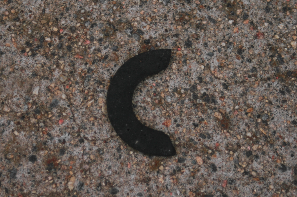


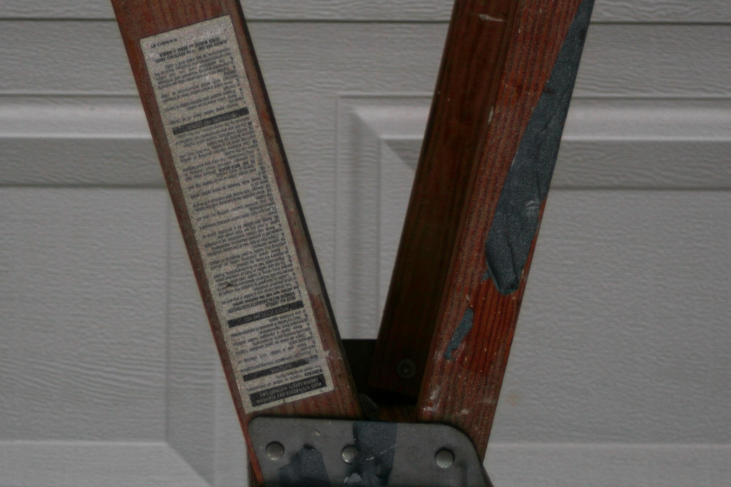
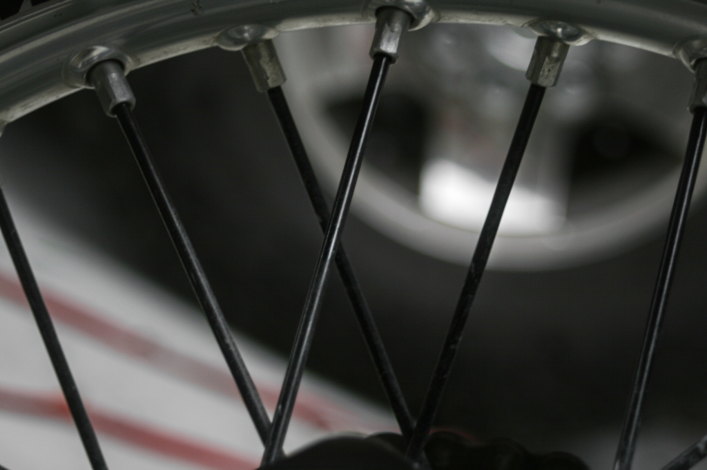


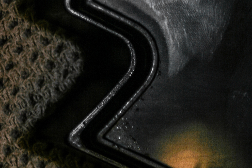
This final sketch was much more difficult than I initially expected it to be. In total, it took me almost a whole day to shoot, edit, and whittle down my images. I shot almost all of my images outdoors which allowed me to create a cohesive color palette and type of subject matter. Although it was tempting, I did not arrange any of the materials to make them look more like a certain letter, but altered angles and cropping in my shots to bring out the shape of each letter. I then edited all 26 images to enhance their earthy, warm color palette and arranged them in order for this final grid.
Looking at all of them together, the images I am the most proud of are those like Q and D that transform everyday objects into letters through inventive angles. The letters made up of straight lines were fairly easy to find in fences, houses, and other structures. Curvy, complex letters like B and D were by far the most difficult to find. Overall, this sketch was a great exercise both mentally and artistically and I really enjoyed digging through my neighborhood for letters.
